New Pandora Design Powered By HTML5
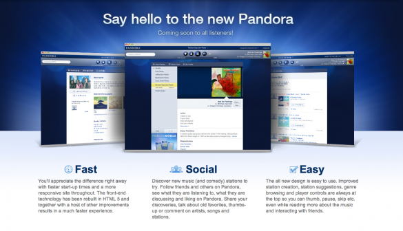
 It’s the season for facelifts, LogicLounge went through a nice redesign that not only speeds up the website but looks cleaner. Other well-known websites have had the same fate, the biggest of them all Pandora, not only gets a facelift but changes framework slightly to be powered by HTML5 instead of clunky old flash.
New Pandora starts rolling out for Pandora One subscribers and will soon expand to everyone else using the streaming music service. Pandora not only needs a redesign but its framework needs to get worked on. The site primarily uses flash to power the front end, as everyone on the internet knows, flash isn’t the best platform for smaller less powered computers. It can cause major issues including your computer to run with a higher CPU usage, that can cause problems, especially if you’re using a netbook-like device.
Pandora’s design is its trademark and everyone knows the familiar blue interface with the logo. All these years of building up a recognizable reputation will have to be changed when the interface rolls out to the masses.
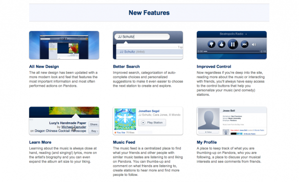
The design of Pandora is overdue for an upgrade, and what Pandora is about to roll out is amazing. It is a very clean interface that is intuitive for anyone experienced or novice to the service. Like we said, the service will start off only for Pandora One subscribers and will soon expand out to more.
The site completely does away with flash and brings in the next-generation framework of HTML5 to power the website.
Pandora’s site boasts the service is more social, faster and easier to use than the old one.
You can check out the full overview here.


