Why You Shouldn't Upgrade To Windows 8

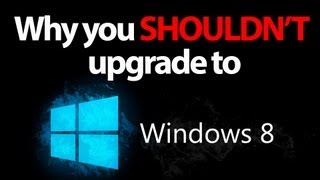
Windows 8 is almost here, one of the big questions for consumers is whether they should buy Windows 8. It has been one of the highest criticized operating systems to date from Microsoft and with the upcoming release, consumers are worried about the future of their operating system.
The biggest gripe that I, and many other people have, is the new ‘metro’ interface. I can’t use the word metro officially now because a company claimed copyright over the word and is threatening to sue Microsoft for it, but as a beta tester and learning they call it metro I can’t help but call it metro. This new interface looks like it should be on a tablet, not a desktop computer. There are Charms that are updatable and can feature information rather than just having icons on the desktop but each time I see it, I want to touch my computer screen which is not a touch screen.
Another radical change is the start button, our beloved start button is gone, replaced by just hovering in the bottom left corner. And after using every pre-release of Windows 8, I’m still not convinced this is the way to go with their operating system. If you were a previous Windows user you will always know that there is a button in the bottom left corner, by default, that looks like something you would press to access all of your functions and programs, including a search bar which is very useful for me. All of that has been replaced with this hovering action that doesn’t translate well to any previous or new user to the operating system. I’ve personally many people struggling to find the start menu on Windows 8 and having to be told where it is after countless minutes of searching.
 As for this new interface, viewing all of your applications in boxes that scrolls to the right and are very big and bulky that takes up most of the screen with little applications being shown is horrible. There is no obvious way to search through applications or lists and can be very difficult to new or existing users.
As for these hovering points, I still don’t get where Microsoft was going with this, there is no obvious way to tell which cornet will do what and because it can be customized per application open, if you’re trying to find setting in application it can be a search operating just to find that one setting.
I think that Microsoft’s decision to remove the traditional Windows desktop was foolish and are going to lose many users who decide to upgrade. They obviously are having an identity crisis and don’t know where to go from here. I’ll be dubbing Windows 8 the Windows Vista of today.


