Facebook Tests New Timeline Design With Just One Column For Posts
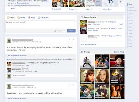
Facebook recently began testing a new version of its Timeline design with only a single column for posts. There are still two columns, but the left one is for items shared on a user’s profile (Wall posts, status updates, etc.), and the right one is for everything else (boxes for Friends, Photos, Places, etc.).
This addresses one of the most common complaints about the new profile: you have to look back and forth on the page as you scroll down. Many people were frustrated by this, and rightfully so. The new design removes the line down the center, making the profile look less like a timeline. However, there is still a timeline of dates in the top right corner allowing you to jump to a particular month or year.
Here’s a look at the new design, thanks to Inside Facebook:
This is a good move by Facebook. Scrolling down someone’s profile shouldn’t feel like watching a ping pong game.
The Next Web contacted Facebook to make sure the new design wasn’t just a glitch, and it, luckily, is not. “This is a new design Facebook is testing with a small percentage of people to make navigating timeline even easier,” Facebook told The Next Web.
Timeline should’ve looked like this from the start. It’s very difficult to read someone’s posts when you have to keep bouncing between the left and right side of the page, and even more difficult to determine the chronology of everything.
This new design looks like a big improvement, so hopefully the test will go well and Facebook will roll it out to all users in the near future.