WTF Was Gizmodo Thinking?

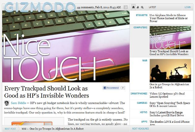
Did Jason Chen walk into a bar and find a web designer? In one of the most hideous web redesigns ever, Gizmodo takes the award. When I first loaded up Gizmodo today I looked at the new design and thought maybe it was my client and the design was for the iPad. It was not, inspecting a little closer I found this awful theme was their new site design.
When you first load the site you are greeted with a huge banner ad, it takes up the first three articles and restricts the user from viewing the stories for around 5 seconds before it disappears. As a web designer myself it goes against everything that I’ve learned.
The new design is a simple two framed design, the left-hand side features the content and is the main viewing window. Taking up the right-hand side is what destroys the theme, this scroll with you sidebar is ugly. When you look closely at the new redesign it looks like the designer took a lesson from YouTube and got the completely wrong idea. Content on the left with comments and other data, on the right, a block ad and suggestions for other articles.
I do complement them on having a good idea but whoever the web designer is executed the idea the wrong way. Like anything that changes it can take some getting used to. But, sorry Gizmodo, this is one theme that should have not seen the light of day.
In the article section of the blog Gizmodo and the rest of the Gawker sites have done away with the social media widgets only opting for a Facebook Recommend button in the post, another stupid move on Gizmodo’s part. Users are now totally helpless when trying to share articles on Twitter and other social media sites Gizmodo previously featured.
In their introductory post they say it’s so that they can put what’s important right there in front of you. What I used to like is being able to scroll through and pick out what was important to me.
I know I speak for most of the social media digesters when I say, bring the old theme back Gizmodo.


