YouTube Releases Sleek New Design

In yet another UI refresh, YouTube has a completely new look inside and out. YouTube claims that this update focuses on subscriptions and channels to help. YouTube claims that this design is simpler and has a cleaner look than previous versions before it. The changes come after a couple months of hints that YouTube was updating their layout yet again.
With this UI update, YouTube wants to focus more on helping users discover videos and make it easier to browse and find new content while on the site. YouTube has long had the subscribe button but it was never easy for someone to subscribe to a channel and stay connected with it. Only last year has the company made it easier to subscribe to your favorite channels and keep up with them.
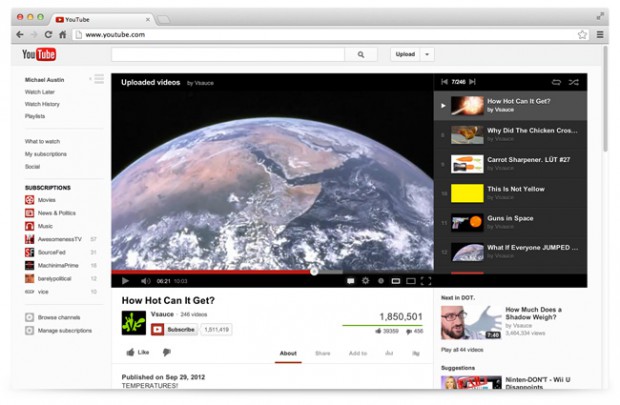
YouTube’s new feature, Guide, wants to help you discover new content around what you’re subscribed to by taking your subscriptions and getting you a list of videos around the same subject as who you’re subscribed to. The Guide is YouTube’s big pushing point when discovering new content. This guide feature will start following you from device to device to keep you up to date on all of the platforms.
You come to YouTube to watch the videos you care about, so it’s important that the videos stand out. In this new layout, you’ll find the most crucial elements are front and center when you watch a video: the video is right at the top of the page and the subscribe button, social actions and video information are all combined directly below the player. Playlists are now available to the right of the video so you can browse through while you watch.
I personally, am a little cautious about the new theme design, over the past years YouTube has focused a lot on the front end design which continues to evolve. For content producers, I feel like features and changes to the back-end have maybe been going in the wrong direction lately. With these new design changes, hopefully YouTube will stop dropping people off of subscription boxes.

