YouTube Tests Out New Design - Codename: Cosmic Panda

 YouTube is at it again, testing out a new, sleeker and darker design of the famous video sharing site via YouTube TestTube.
The project has been dubbed by YouTube, Cosmic Panda and was announced today on YouTube’s blog. First off, this experiment is by no means what the future of YouTube will look like or the next design of the site. But, I must say first impressions about the new design is very nice.
We are always testing new things on YouTube with the goal of improving the site’s overall experience,†a rep tells us. “We encourage all users to opt in to this experiment and tell us what they think about it.
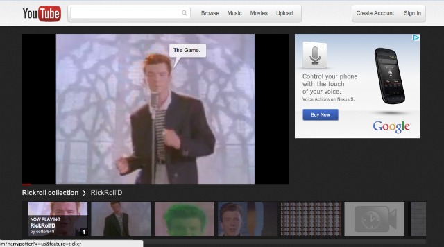
If you wish to enter the Cosmic Panda test, you can visit YouTube TestTube and click the link to enter. Upon activating Cosmic Panda you will be suggested to check out a YouTube Video (Nyan Cat), channel (The Cheezburger Network, HBO or The Young Turks) or playlist (Rock Rolls).
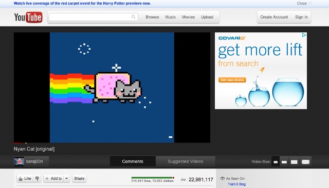
Changes are quite different from the current design. The main point including the video, where the video will be featured with a black background and new dark player design. All content will be found below the video in a different layout. The featured video will also include an easy size switcher to re-size the video in-browser.
Overall, the biggest change can be found with YouTube channels. It features a new header that is much more clean and streamlined. With the current design, the featured video will start playing automatically, now with the new version it will only be a graphic that when clicked will bring you to the featured video. Videos can now be found under three tabs “Featured,†“Video†and “Community.†The setup is now much cleaner and looks very pleasant.
Playlists have changed, but not by much. With the new version, you can change the size of the videos easier than before, but take note that there isn’t a “Shuffle” feature anymore.
The proposed redesign looks very nice and there is still much that we could see done to it.

